 Renoox
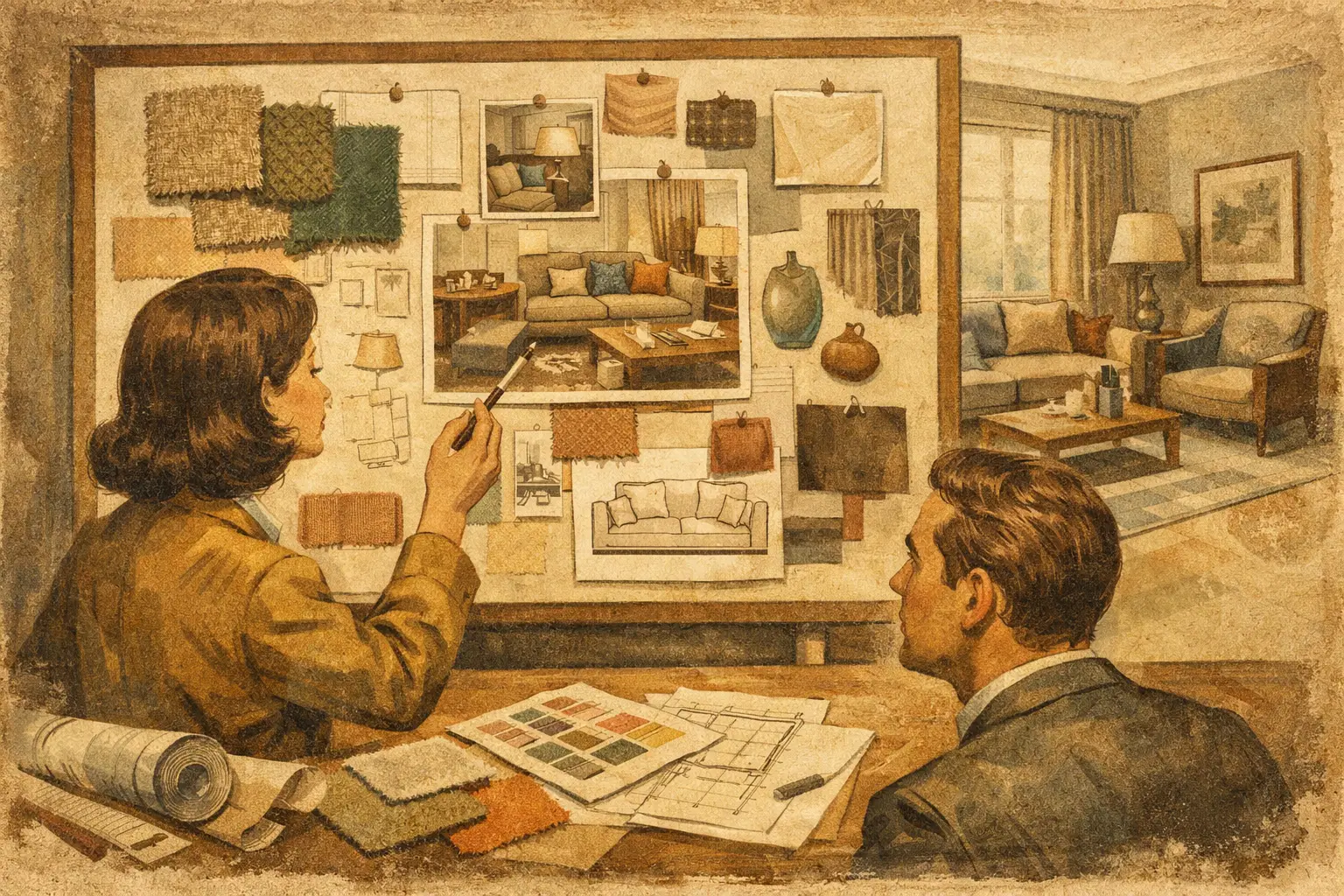
When a client says "I want it warm and simple, but not ordinary", a designer cannot just send over a set of attractive reference images. You have to turn a vague preference into a scheme that has logic, can be purchased, and keeps the budget under control. Learning how to make a soft furnishing proposal board is not really about learning to make collages. It is about using visual language to move a client towards a decision, and proving that your design can be delivered.
For anyone hoping to enter the interior design industry, the soft furnishing proposal board is also one of the parts of a portfolio that best shows professional ability. It demonstrates more than taste: understanding of the brief, product selection, spatial coordination, cost awareness and presentation skills.
First understand what a proposal board is for
A soft furnishing proposal board usually serves the early or development stage of a project. It is used to confirm the overall style, the main colour relationships, the feel of the materials, the silhouettes of the furniture, the mood of the lighting and the direction of the decoration. It is not a "collection of inspiration images"; it is a visual decision document between the client and the design team.
An effective board lets the client answer three questions quickly: What will this space feel like in the end? Why does each choice suit me? Is the scheme feasible in terms of budget, dimensions and how the space is used? If, having looked at it, the client can only say "it seems fine", your information hierarchy or design logic is not yet clear enough.
The depth of the board depends on the project stage. At concept stage it can stay somewhat open, with the emphasis on confirming direction. Once the project moves into procurement or execution, it must include specific products, dimensions, price ranges, material notes and alternatives. Do not let an overly abstract mood board stand in for the procurement scheme that later stages require.
How to make a soft furnishing proposal board: start with the brief, not the images
Before you start collecting images, organise the design brief. At a minimum, establish the type of space, who lives or works there, their daily habits, the existing hard finishes, the budget range, the completion date, and the style elements the client explicitly likes or rejects.
Take the same "warm modern" direction. A family with pets and young children needs hard-wearing, easy-to-clean fabrics; someone who reads at night needs local lighting and dimmable fittings. A scheme for a short-let property has to prioritise durability, ease of replacement and how it photographs. Without this information, the later choices of colour, rug or sofa easily collapse into personal preference.
Condense the brief into a single design positioning statement, for example: "A low-saturation modern living room for a young couple in a small apartment, balancing working from home with entertaining friends." That sentence becomes the standard for filtering every image and every material. Attractive elements that have nothing to do with the positioning should be dropped without hesitation.
Use concept words to build a consistent design language
Do not use too many concept words; three to five is usually enough, say "restrained, natural, refined, light". Then find visible design evidence for each: natural might map to oak, linen and plant forms; light might map to slender-legged furniture, white space and translucent materials.
The value of doing this is that you no longer need "I think it looks good" to persuade the client. Every piece of soft furnishing has a defined role, and the client finds it much easier to understand why a heavy dark leather sofa does not belong in a space built around lightness.
Build the skeleton of colour, material and proportion
A mature proposal board shows the overall relationships first and the individual items second. Start with one main colour, one supporting colour and one or two accent colours, and control the proportions through large, medium and small areas. Greige, warm white and pale timber often make good bases, but that does not mean every project should be "cream style". The orientation of the space, the colour of the existing floor, the client's collection and a commercial brand's positioning will all change the colour judgement.
Material choices need the same balance. Velvet, wool, timber, rattan and stone bring rich layering, but concentrate all of them in one small space and the picture becomes crowded and the maintenance burden rises. Setting smooth against rough, matt against slightly reflective, and soft against hard, in moderation, usually reads as more refined than stacking up "trending" elements.
On the page, keep a clear set of colour swatches and material samples, annotated with their key uses: dark tones for cushions and artwork, stain-resistant fabric for the main sofa, timber tones kept in step with the existing cabinetry. When the client can see the use, they understand the proportions rather than remembering a single colour.
Product choices have to survive the test of delivery
Furniture, lighting, curtains, rugs and accessories need to serve the space together rather than compete for the visual centre. When choosing products, check not only the style but also the dimensions, seat height, clearance for passing, cleaning method, lead time and price. In a small apartment especially, the sofa depth, the margin around the coffee table and the pull-out distance for dining chairs often decide the experience far more than the product photograph.
The board does not need to list every SKU, but the key items should carry clear information: product name or category, dimensions, material, colour, quantity and budget range. For bespoke items or products whose stock is unreliable, add an alternative direction, such as "pale oak side table with rounded corners, 40 to 50 cm diameter acceptable". That preserves the design intent while reducing procurement risk.
In real projects the budget usually forces trade-offs. Put the budget first into the items that are used most, are largest and most affect comfort: the sofa, the mattress, the dining chairs and the main light. Accessories can be added in stages, but do not omit common costs such as curtains, installation, delivery and taxes just to bring the initial quotation down.
Let the layout help the client decide quickly
One board expresses one core theme. The living room, bedroom, dining area or public zone can each be presented separately; avoid compressing every product in the whole house onto a single page. The layout usually establishes the atmosphere with a main visual, then adds swatches, materials, furniture and lighting as supporting evidence.
More images are not better. If a dozen sofas, accessories and interior shots in different styles appear on the same page, the client first feels confused and then starts rejecting items one by one. Keep the most representative images, and maintain a professional feel with a consistent background, grid alignment and enough white space. Typography should not compete for attention; titles, notes and product information need a stable hierarchy.
For client presentations, add a short note to every page explaining its design objective, for example: "Warm grey and oak establish a quiet base; brass and deep green add layering at night." One sentence with a judgement in it is more effective than a paragraph of style adjectives.
In the presentation, do not just read out the board
The board is a communication tool, not a document that falls silent once it is handed over. When presenting, first restate the client's needs, then explain how the concept responds to them, and finally walk the client through the colours, materials and key products. That order makes clear that you are solving problems, not just showing taste.
When a client says "the colour is too dark" or "it does not feel warm enough", do not throw out the whole scheme at once. Ask about the specific concern first: are they worried the space will look smaller, that there is not enough daylight, or do they want it to work more easily with their existing furniture? Different reasons call for different adjustments. You can also prepare two controlled options, keeping the main colour structure, say, and adjusting only the lightness of the curtains and the armchair. Professional revision is not endless accommodation; it is a reasoned choice made within the agreed concept.
The three most common beginner problems
The first is mixed styles. Wabi-sabi, French, minimalist and mid-century elements can coexist, but they must be linked by shared colours, materials or furniture lines; otherwise it is just a patchwork of fashionable labels.
The second is doing atmosphere without doing scale. The two-seater sofa on the board may look lovely and still not fit the actual plan. Cross-checking the soft furnishing proposal against the 2D furniture layout, the elevation information or the 3D view is an important part of a professional workflow.
The third is ignoring executability. A design with no sources, no budget and no specifications struggles to reach procurement and installation. A portfolio can show concepts, but if you want a design assistant or soft furnishing designer role, it is best to show at the same time how you develop a concept into a schedule and a spatial scheme.
In project training at Renoox Academy, soft furnishing expression advances alongside plan layout, technical understanding and 3D visualisation. Clients do not split design work into a separate "aesthetic part" and "execution part", and a professional designer needs the ability to connect the two.
Next time you make a proposal board, do not rush to save images. First write down what the client really needs, what the space actually allows, and what you want the client to feel in the first three seconds of walking into the room. When every choice can answer those three questions, your board grows from something that looks good into professional work that earns trust and project opportunities.